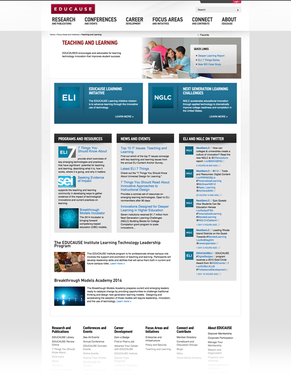
BEFORE
Landing Page for the EDUCAUSE Teaching and Learning Inititative
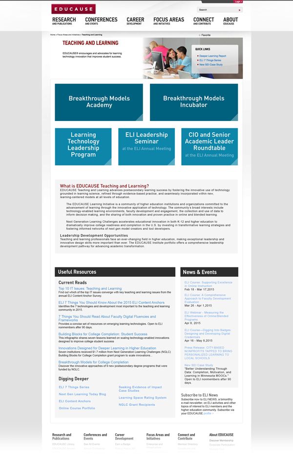
AFTER
Redesigned Landing Page for the EDUCAUSE Teaching and Learning Inititative
The EDUCAUSE Teaching and Learning landing page was lacking any focus or organizational hierarchy. Overuse of graphics and icons resulted in visual chaos that left the viewer unsure of what to do. A weak attempt at call to action did exist at the top, however an overuse of fades and poor color distinction were showing poor results in analytics review.
By redesigning this page into a primary, secondary, and tertiary approach where the most important call to actions are placed at the top, a more prominent description of what the service is, and finally some other resources that can be useful, this page has seen a dramatic increase in user flow and activity.